Accredia Gets a Makeover: New Market Image, Same Commitment to Quality

Modernity, flexibility, accessibility, and navigability were the key themes of the rebranding of the Accreditation Body, which now unveils a new graphic and digital identity to the market, consistent with its enduring commitment to quality.
On December 3, Accredia unveiled its new institutional logo and system of accreditation marks, the result of a rebranding effort that represents a significant milestone in Accredia’s growth. This redesign provides a distinctive look that aligns seamlessly with its mission.
Accompanying the new image is the launch of a refreshed website, highlighting the evolution of accreditation in Italy. For 15 years, this system has supported the competitiveness of businesses in both national and international markets, thanks to the expertise and impartiality of accredited bodies and laboratories.
The institutional website
The new web project provides an integrated form to Accredia’s digital identity, leveraging the streamlining of information and the redesign of the informational architecture. This has improved the accessibility of content and document resources across all areas of the site, particularly those intended for professionals.
Organizations and laboratories looking to submit an accreditation application or access relevant documents now benefit from a simplified process. Numerous dedicated sections aim to provide precise answers or useful content tailored to the type of accreditation and specific needs.
The synergistic effort between web design and technological development, carried out by the agency Cultur-e on the WordPress platform, has delivered a User Experience that is “simple but not simplistic,” enhancing site navigation for all users.
The institutional logo

The logo redesign represents a transformation and alignment with a more modern visual identity, designed by the agency Melazero. It combines three powerful symbols: the letter “A,” signifying excellent quality; the triangle, representing authority and stability; and the circle, a symbol of inclusivity, eternity, and perfection.
Accredia’s image is distinguished by two main colors: graphite and ochre. Graphite, elegant and sophisticated, represents balance and stability. Ochre evokes the positivity and energy of the sun, symbolizing an openness to the future and a commitment to change.
The choice of the font, Roboto, also reflects modernity. With clean and decisive lines, this typeface conveys Accredia’s contemporary spirit, adapting seamlessly to any medium or format while ensuring a fluid and natural reading experience.
The new payoff, “Compete to Grow,” highlights Accredia’s commitment to ensuring the competence of organizations and laboratories, while also emphasizing the opportunities for businesses and professionals to better compete in the market through accredited certifications, which serve as a tool for business growth.
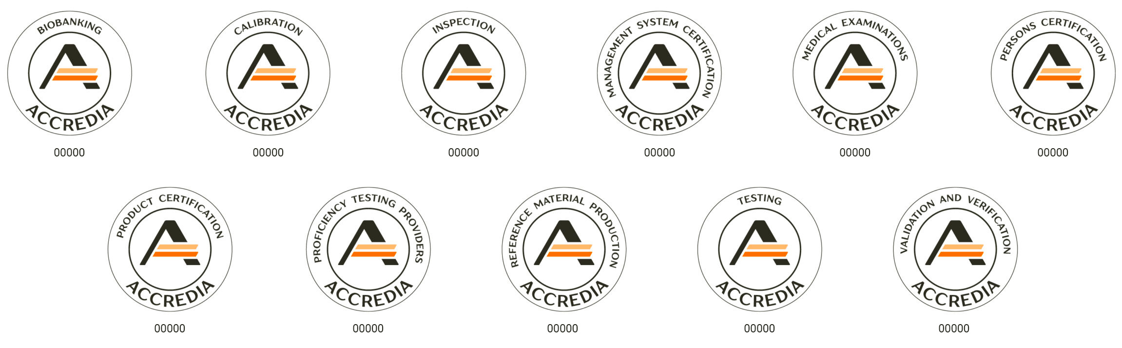
The accreditation mark

The mark identifying accreditation certificates, issued by Accredia to accredited organizations and laboratories, incorporates the circular shape more immediately and, like the institutional logo, features two parallel ochre lines.
The stylization of the central bar of the “A” evokes the checkmark of a double verification, symbolizing Accredia’s role as the “controller of controllers.”
The mark grants Accredia certifications the highest level of reliability and facilitates the free movement of products and services in the global market, thanks to the competence and impartiality of the organizations and laboratories that certify, verify, inspect, or test them.
The accreditation marks
In line with the institutional logo and the accreditation mark, dedicated accreditation marks have been designed for accredited organizations and laboratories. These marks make certificates of conformity and calibration, verification statements, and test and inspection reports easily recognizable in the market.
Among the key updates to the system, each accreditation mark is now associated with a specific conformity assessment scheme, allowing for the identification of the particular activity in which the organization or laboratory has obtained accreditation—from management systems to products and services, from testing to calibrations, and more.
Public and private organizations, as well as professionals who utilize conformity assessment services provided by accredited bodies, can also display their dedicated accreditation mark.